Designing a cohesive and visually engaging space is not just about furniture placement or style choice, it's about curating a sensory experience. One of the most powerful and versatile elements in any room is wooden décor, celebrated for its warmth, natural grain, and timeless appeal. Yet, integrating wood into your color scheme and home design requires more than instinct, it calls for thoughtful coordination of both color and texture.
In this comprehensive guide by Intarsia, we explore how to harmonize handcrafted wooden pieces with your home's color palette, amplify textural depth, and elevate the overall aesthetic with grace and clarity. Whether you're designing a contemporary studio or refreshing a rustic reading nook, this guide will help you find the perfect balance between wood and hue.
1. Understand Wood Undertones
Before selecting decor or matching colors, it's essential to identify the undertone of your wood pieces. Wood can have:
-
Warm undertones (red, orange, yellow): mahogany, cherry, oak
-
Cool undertones (gray, taupe, ash): walnut, maple
-
Neutral undertones (balanced or light): beech, white oak
Recognizing the undertone helps determine what color palettes will naturally complement the piece. For instance, warm woods pair beautifully with earthy tones like terracotta and olive, while cool woods excel beside blues, charcoals, and soft neutrals.
2. Contrast or Blend: Choose Your Path
There are two foundational strategies for working with color and wood:
-
Blending: Choose wall colors and textiles that match the undertone of your wood for a soft, monochromatic feel.
-
Contrasting: Use complementary colors (opposite on the color wheel) to make the wood grain pop.
A light oak table against a charcoal wall creates stunning visual contrast, while warm-toned walnut set against taupe walls produces seamless warmth.
3. Layer Neutral Tones for Sophistication
Minimalist and modern spaces often rely on neutrals, but layering them thoughtfully is key. Combine whites, creams, beiges, and grays with wooden accents to add depth.
For example:
- A white wall with a natural ash wood shelf
- Beige linen seating paired with warm oak wall art
Wood texture introduces a grounding organic element that keeps the space from feeling sterile.
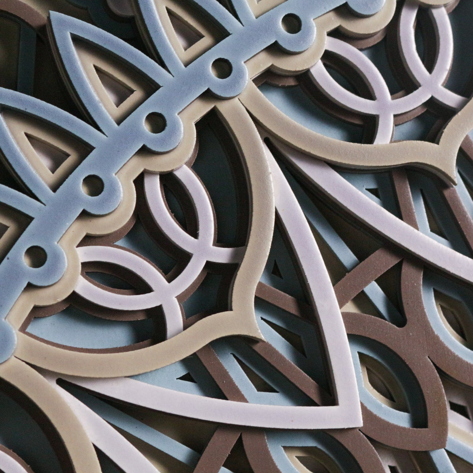
4. Add Depth with Contrasting Textures
Even within the same color family, a variety of textures can dramatically shift the mood. Pair smooth wooden surfaces with tactile fabrics like wool, linen, or rattan for contrast.
A matte wooden sculpture on a woven runner or a polished wood tray on a stone tabletop creates layered visual interest.
5. Use Accent Colors Thoughtfully
Introduce color through accent pieces like cushions, rugs, or artwork that echo the undertones of your wooden décor. For example:
- Pair deep green or mustard yellow with rich walnut
- Match pale blues or blush pinks with ash or maple
Let the wood anchor the space while color flows around it in controlled, intentional ways.
6. Consider the Lighting
Lighting drastically affects how both wood and paint colors appear. Natural light enhances wood's true tones, while artificial lighting can shift them.
Warm lighting deepens the richness of wood grain, while cool lighting can highlight lighter finishes. Always test wood and paint samples under various light conditions in your home.
7. Style Room-by-Room with Wood as the Constant
Different rooms may have different color stories, but consistent use of handcrafted wood creates harmony throughout the home.
-
Living Room: Pair oak furniture with sage green textiles
-
Bedroom: Blend maple with soft whites and pale grays
-
Kitchen: Use walnut shelving against creamy subway tile for depth
-
Office: Highlight mahogany with navy or slate walls
This technique builds cohesion without sacrificing variety.
8. Balance Bold Palettes with Wood Tones
Bold wall colors or statement art pieces can dominate a room. Introduce wood to restore balance and natural grounding. The organic texture of wood tempers the drama of jewel tones or high-contrast patterns.
A deep teal wall becomes inviting when grounded by a reclaimed wood mirror or handcrafted wooden chair.
9. Use Wood as a Color Bridge
If you're blending multiple color zones in an open space (like living-dining combos), wood elements can act as transitional anchors. A large wood centerpiece or custom art piece carries subtle warmth across contrasting palettes.
Example: Use a warm-toned wood bench to connect a gray-toned kitchen with a tan-hued living space.
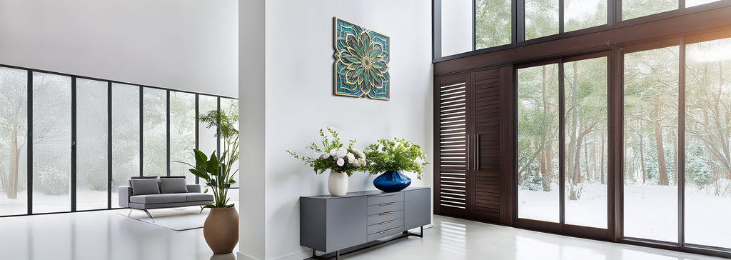
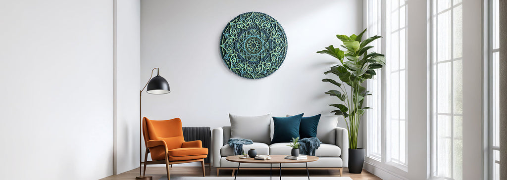
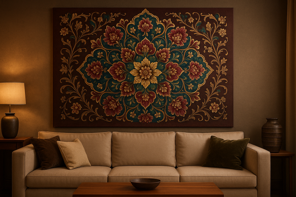
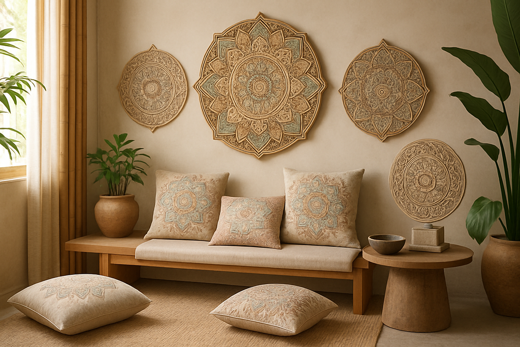
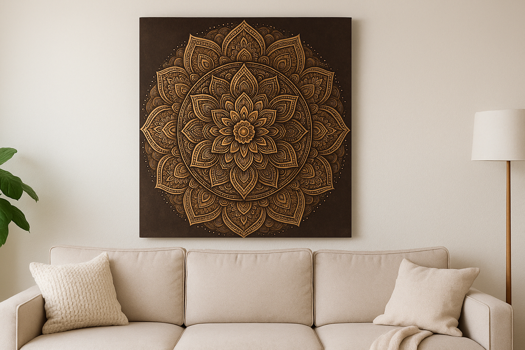
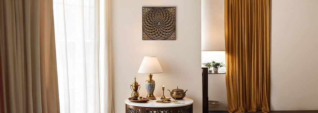
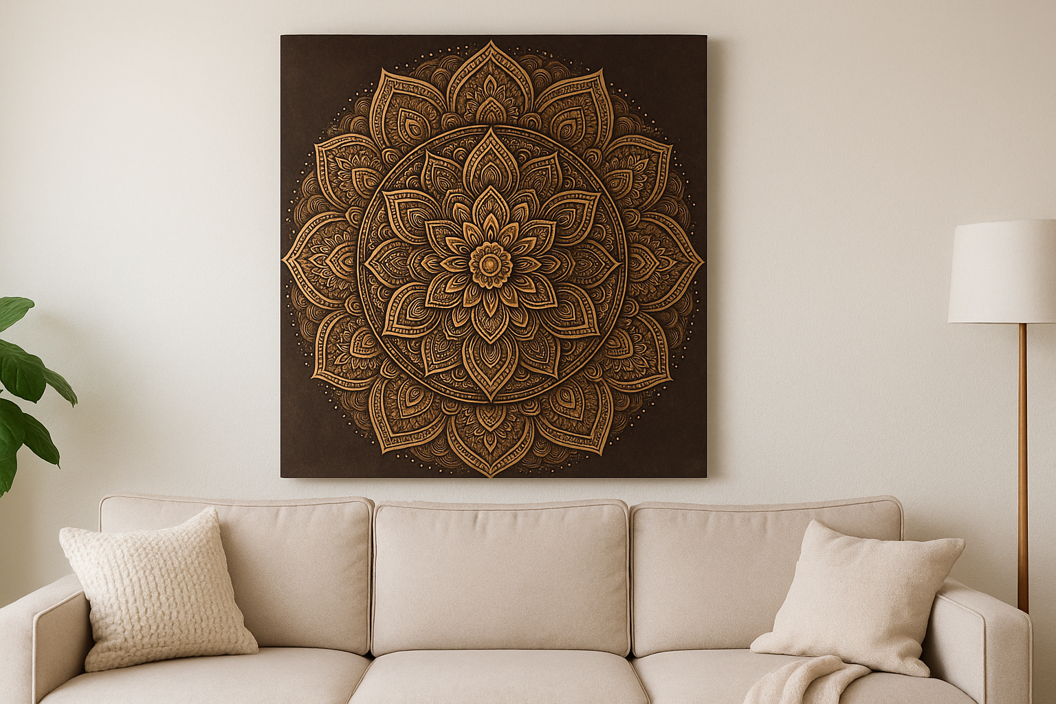
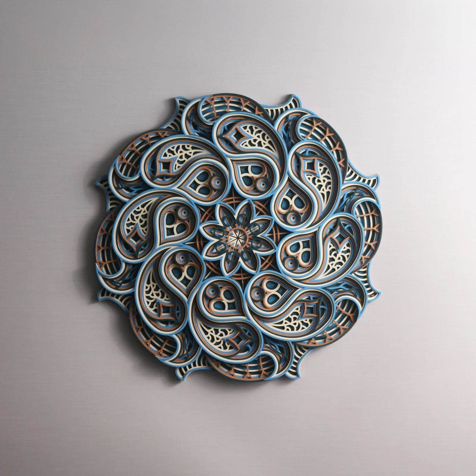
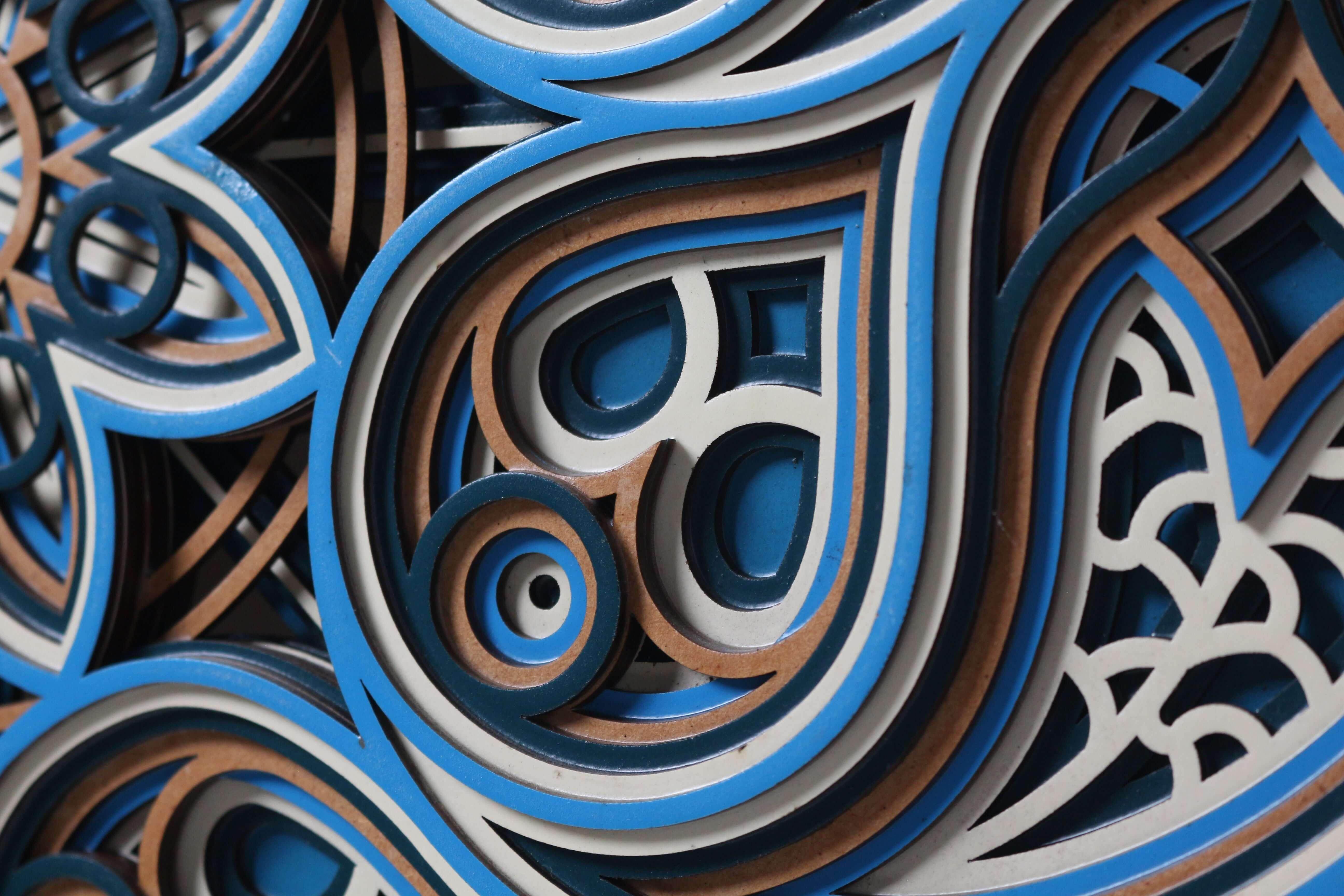
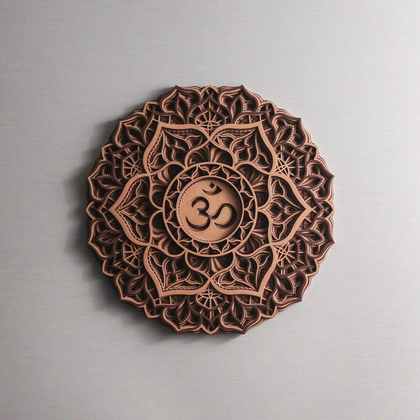
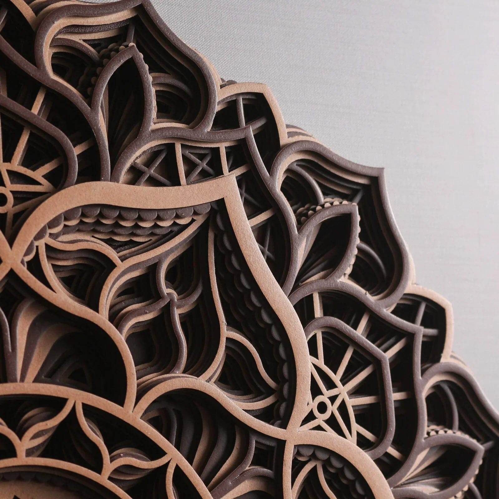
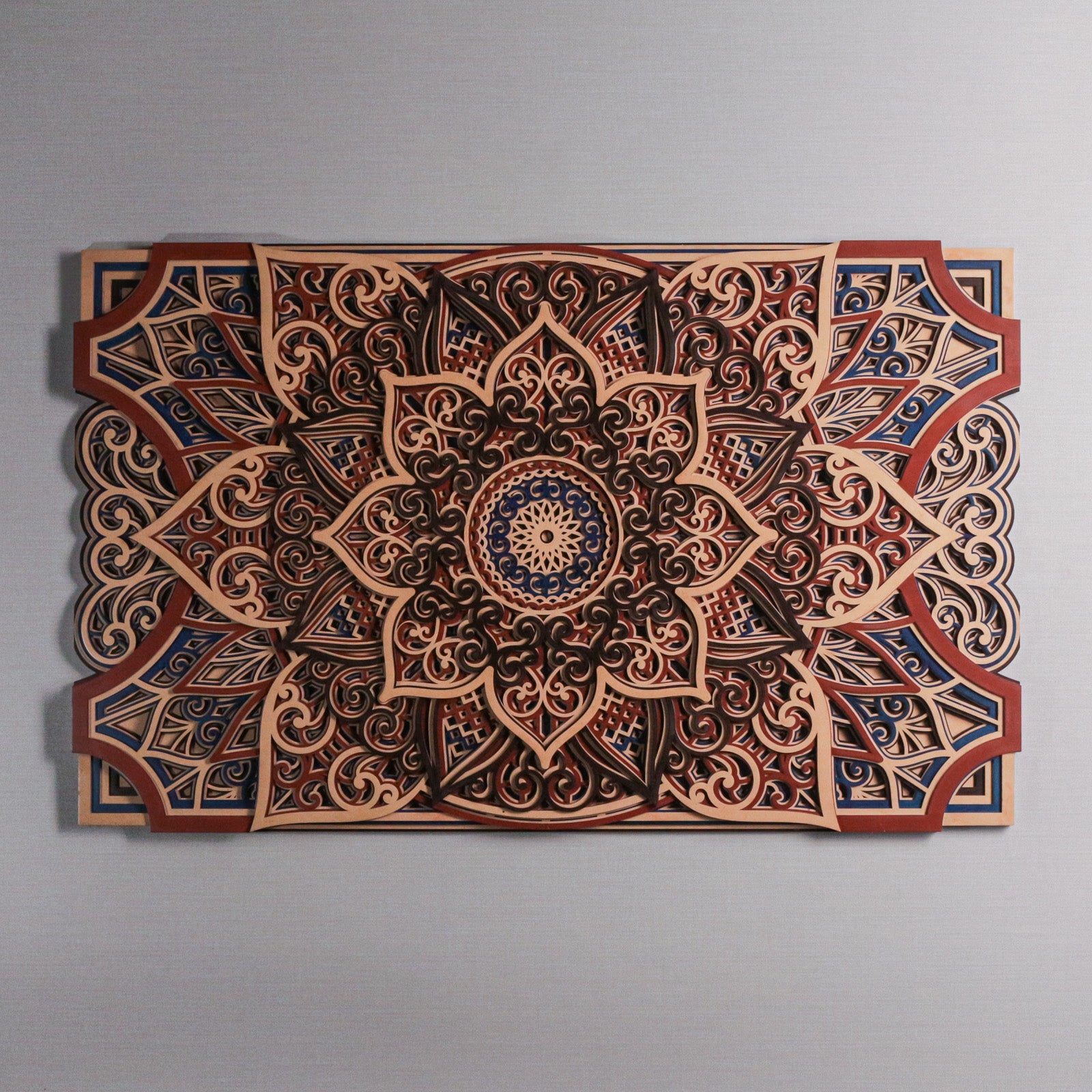
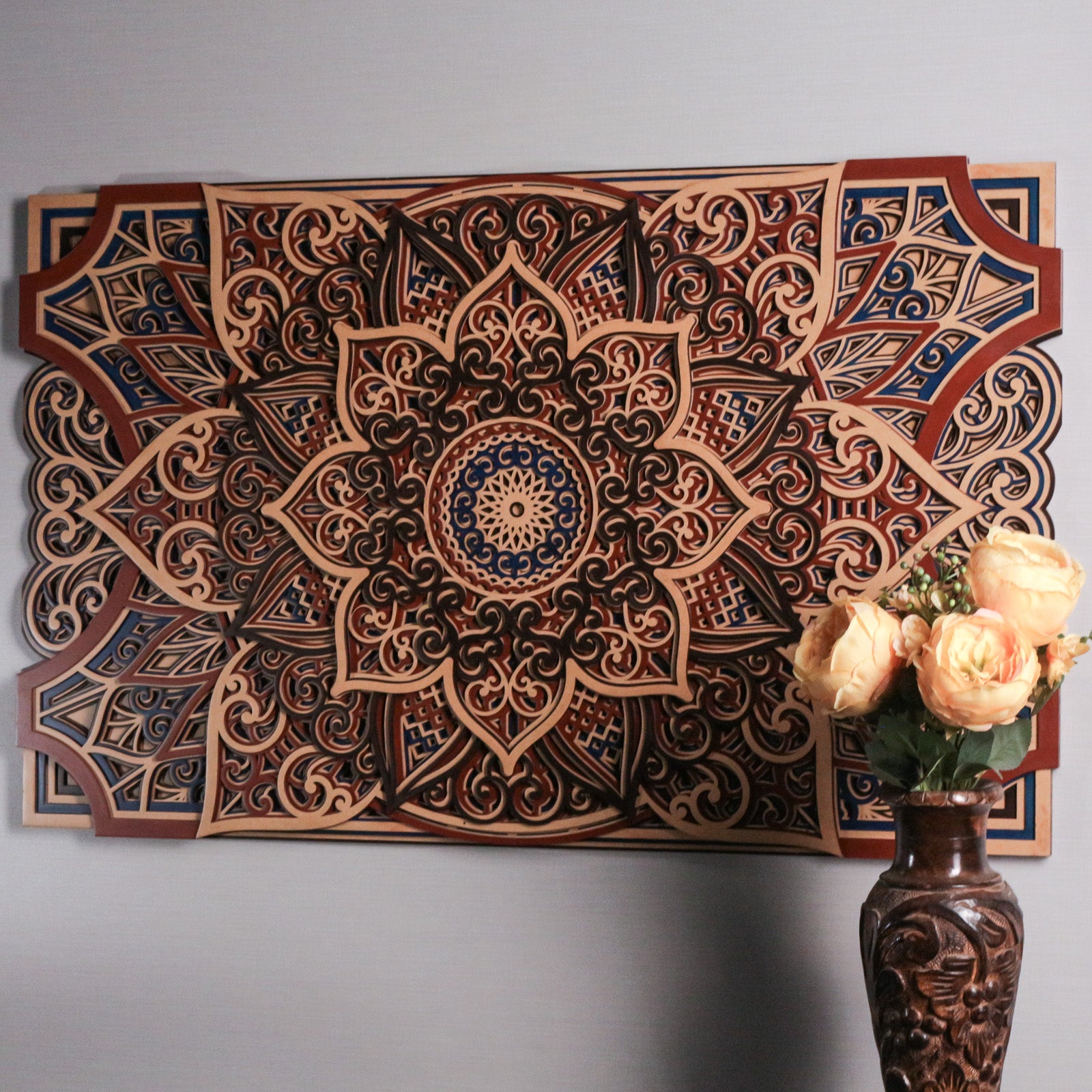
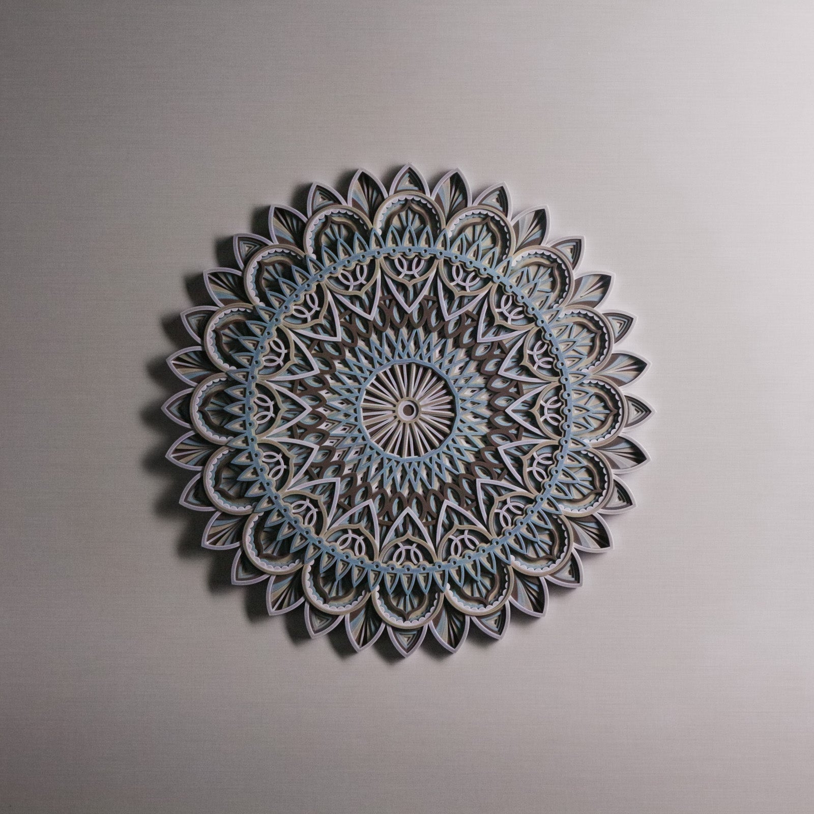
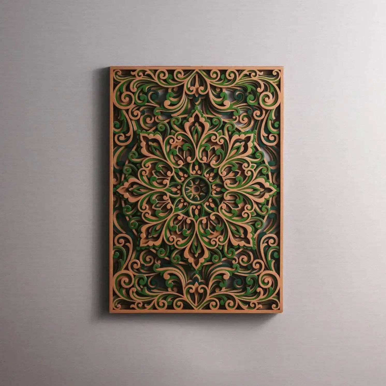
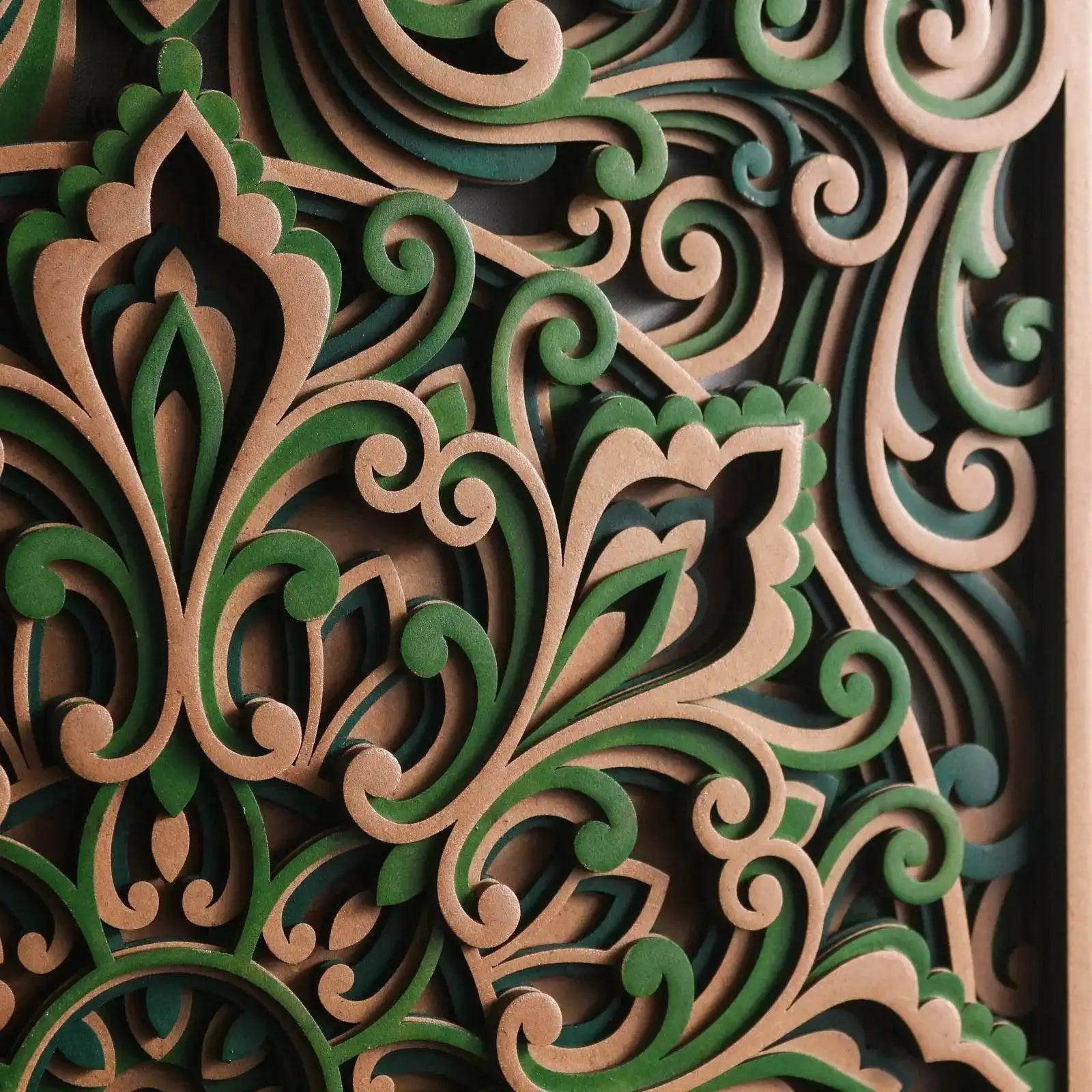
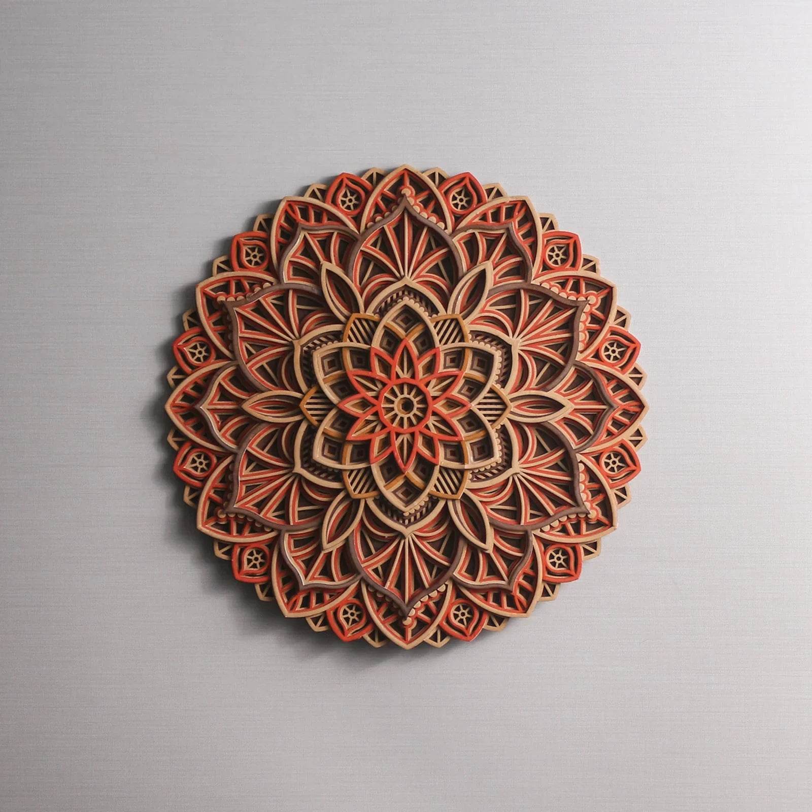
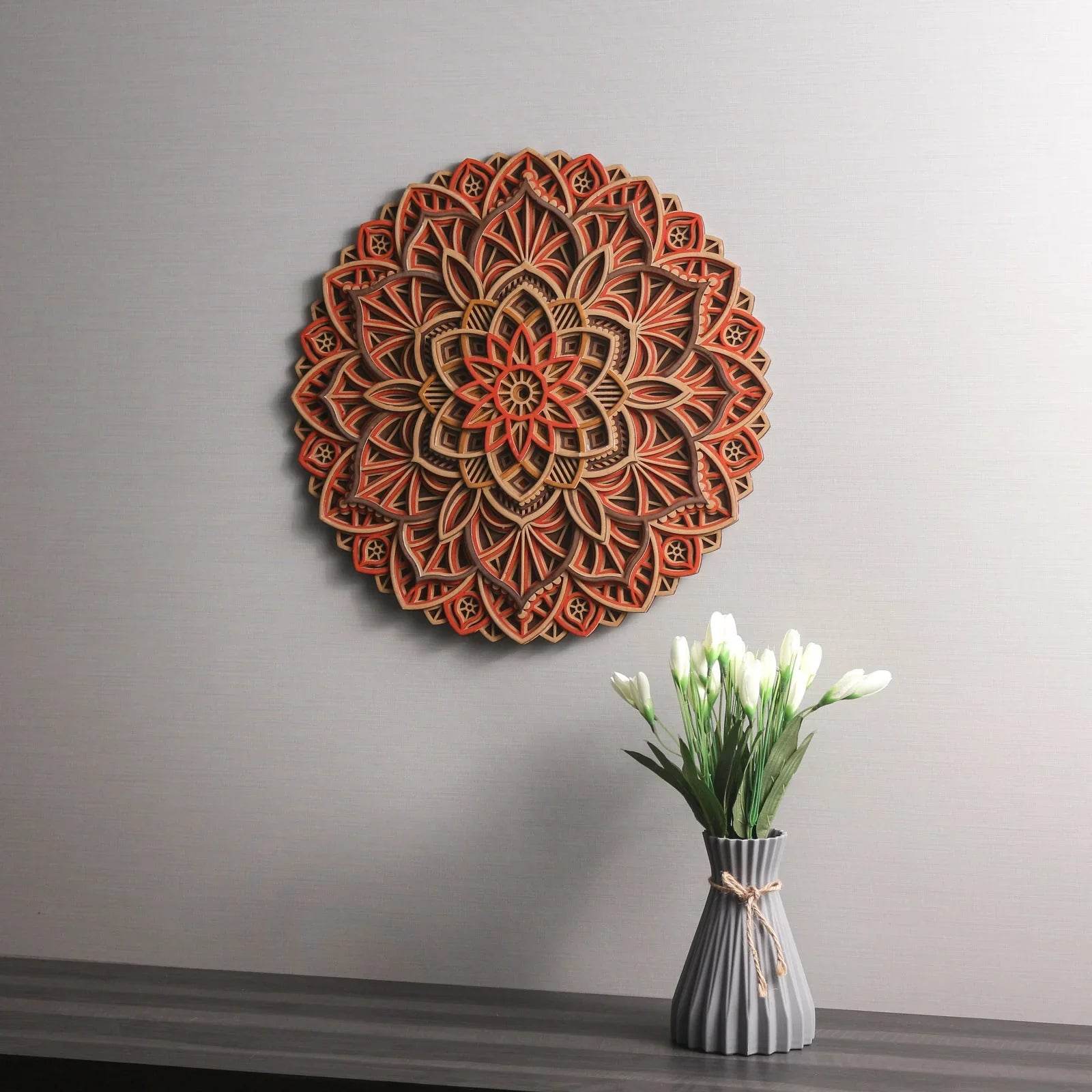
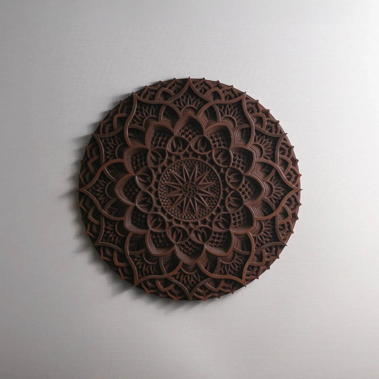
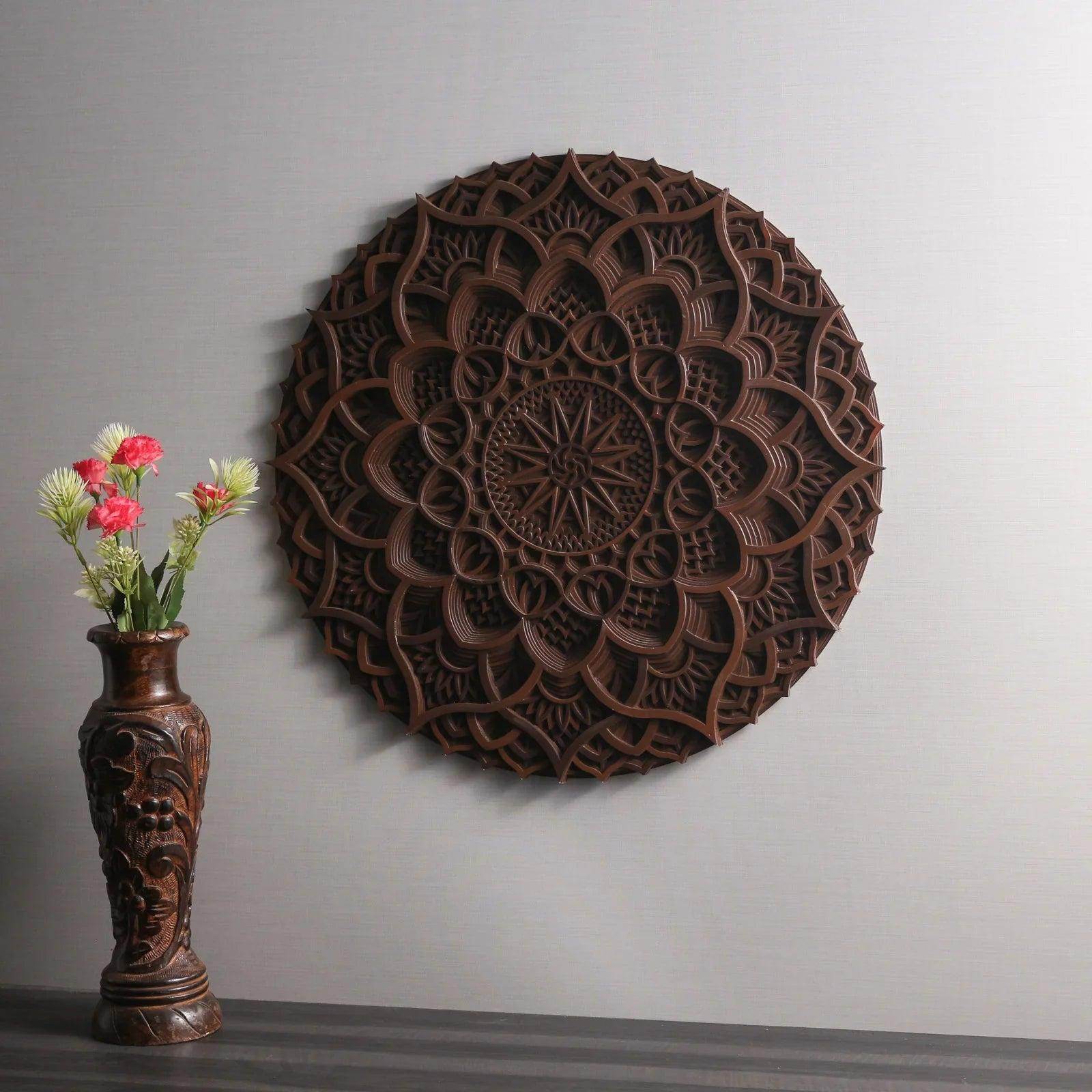
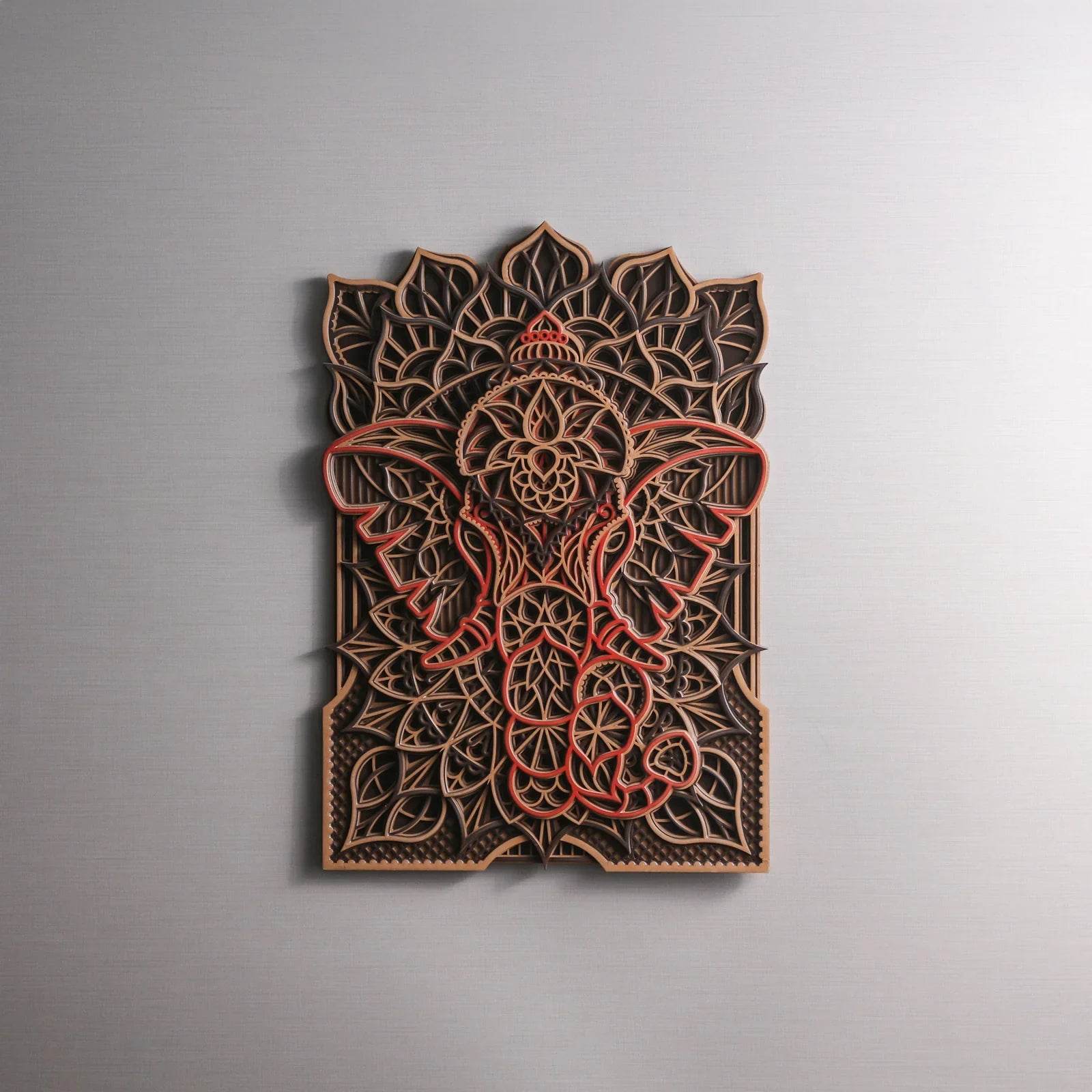
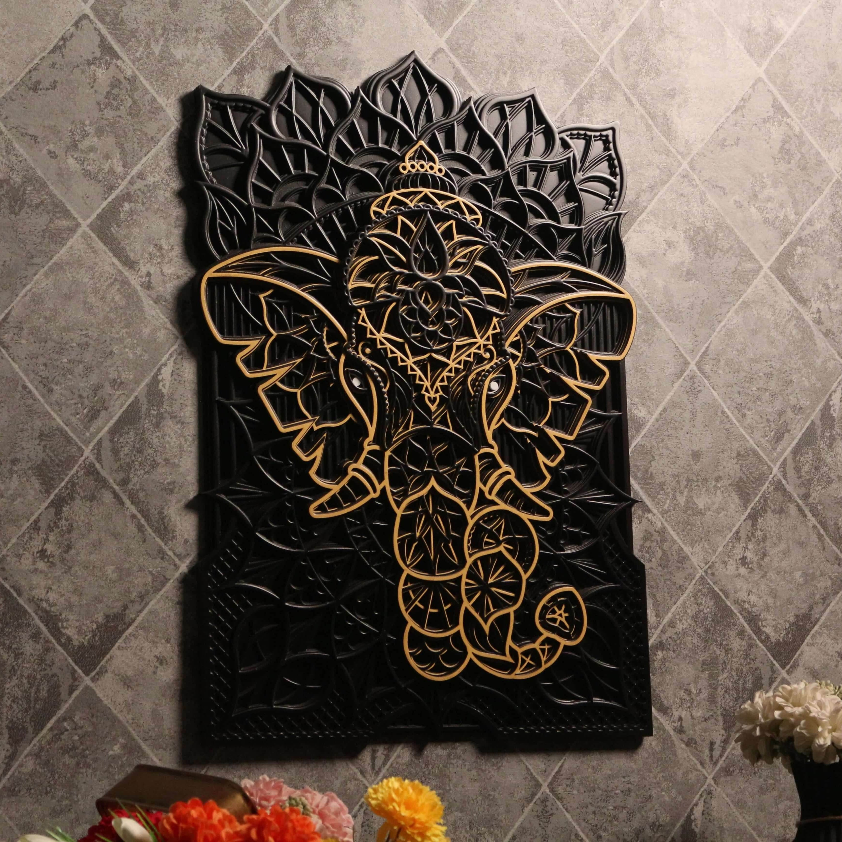
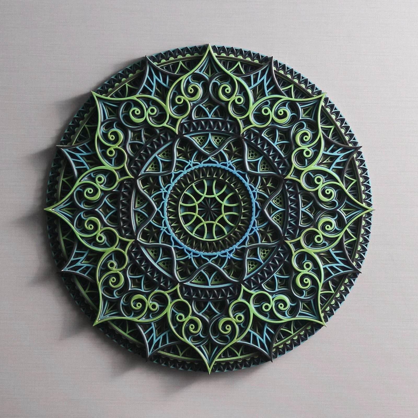
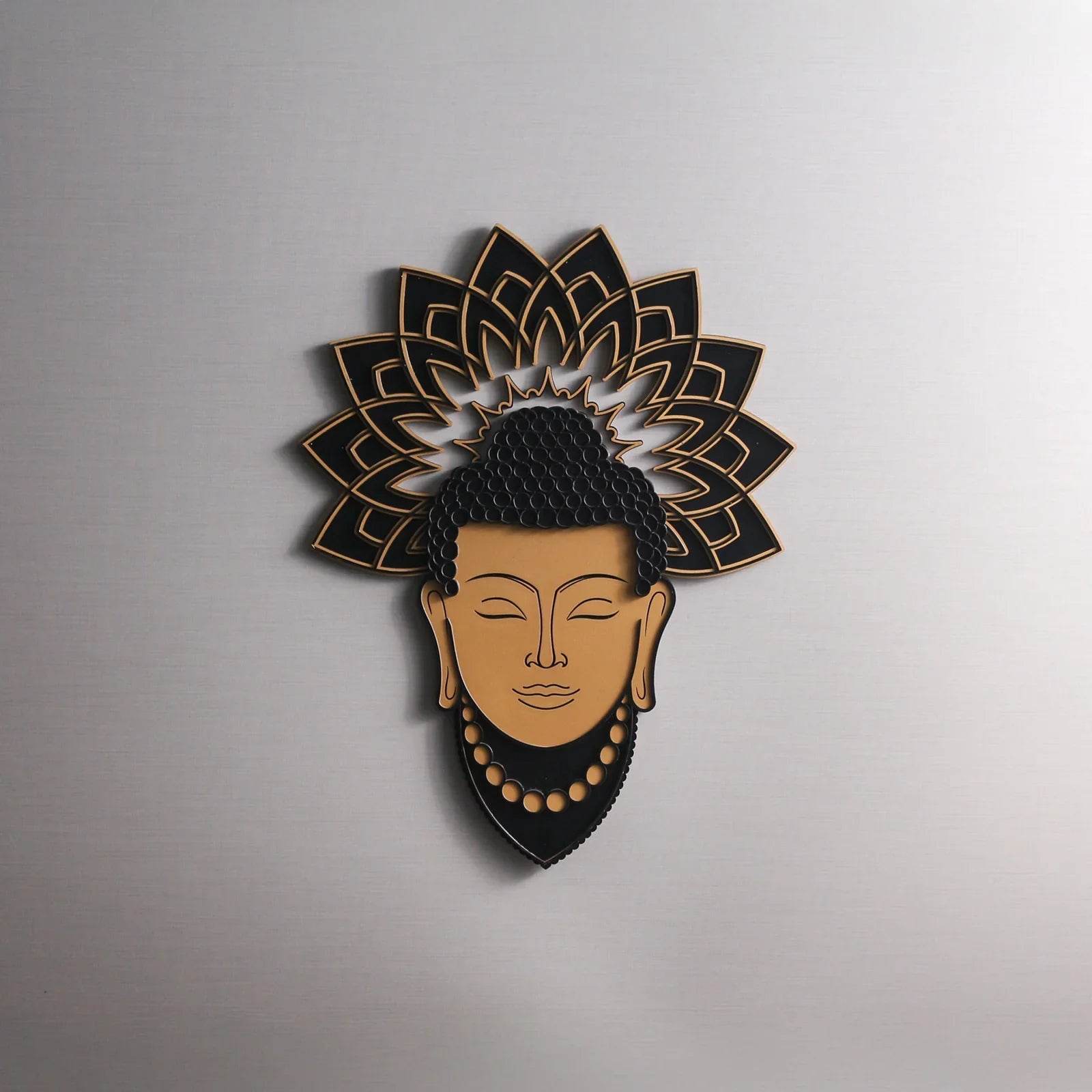
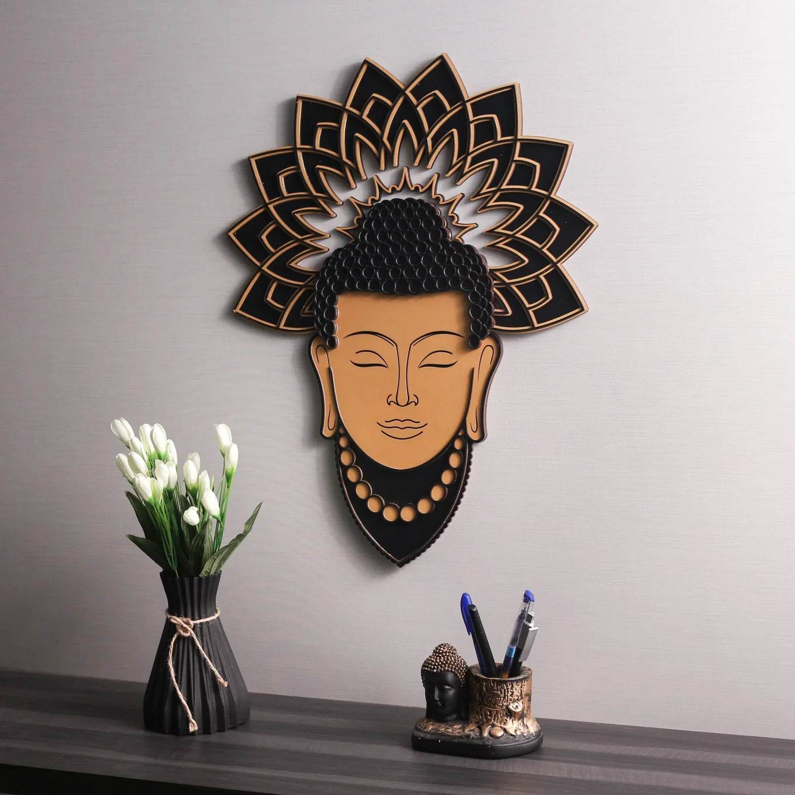
10. Infuse Personality with Artisanal Wood Décor
Beyond structural furniture, use handcrafted wooden decor to layer in narrative and individuality. These items bring warmth, story, and uniqueness, and they often come in versatile tones that adapt to various palettes.
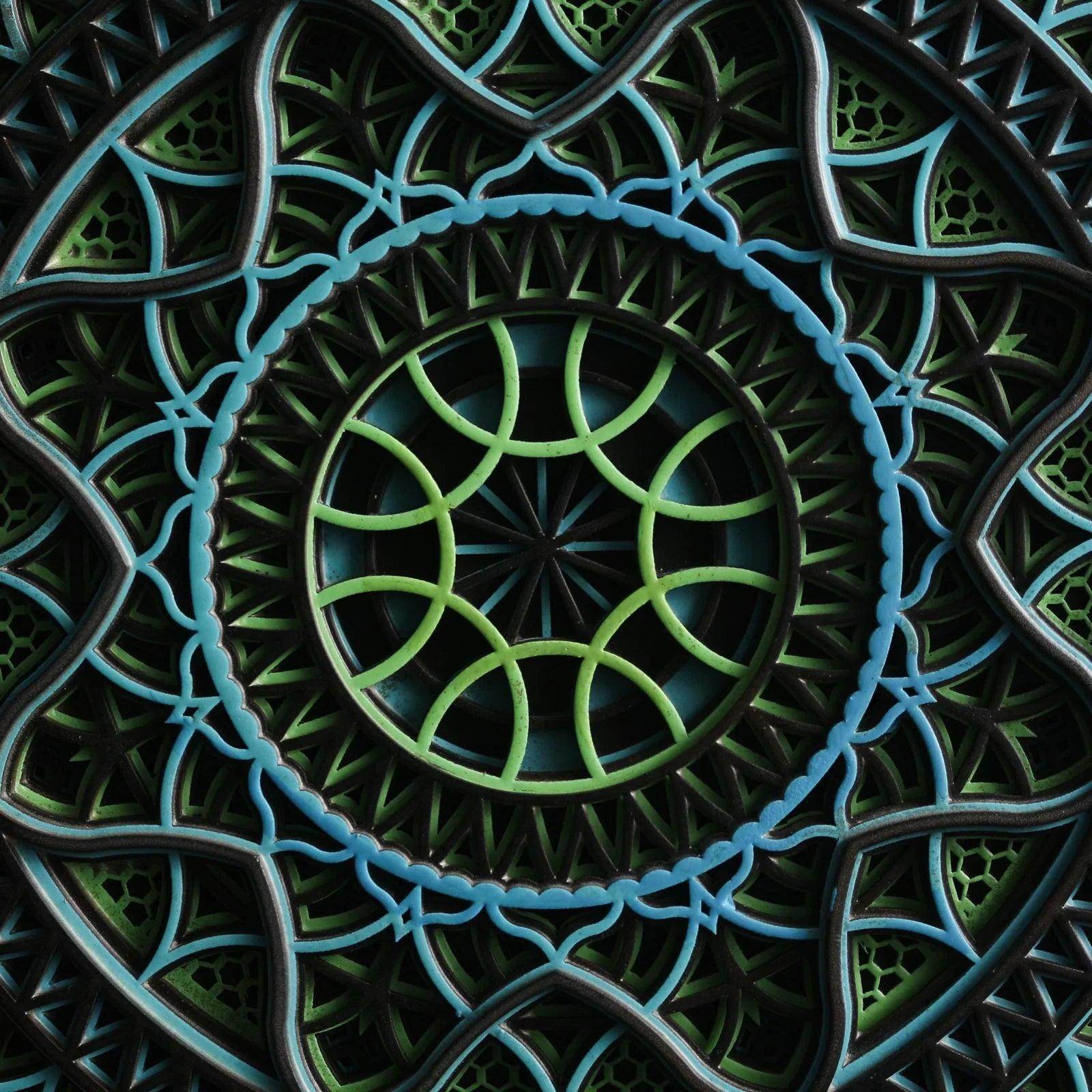
Whether it's a carved mandala wall piece, a turned wooden vase, or an engraved shelf, these elements reflect care and character.
Closing Thoughts: Where Color Meets Craft
The fusion of wood décor with thoughtful color selection is more than an aesthetic decision—it's a way to root your environment in calm, authenticity, and timeless beauty.
At Intarsia, our collection of handcrafted wood pieces is curated to blend effortlessly into diverse color stories. Whether you're refreshing a corner or styling an entire home, let wood and color work in quiet collaboration to create spaces that feel as good as they look.